Maximizing Impact: Color Psychology in Plastic Card Design Strategies
Color Psychology Plastic Card Design
Get an Instant Quote
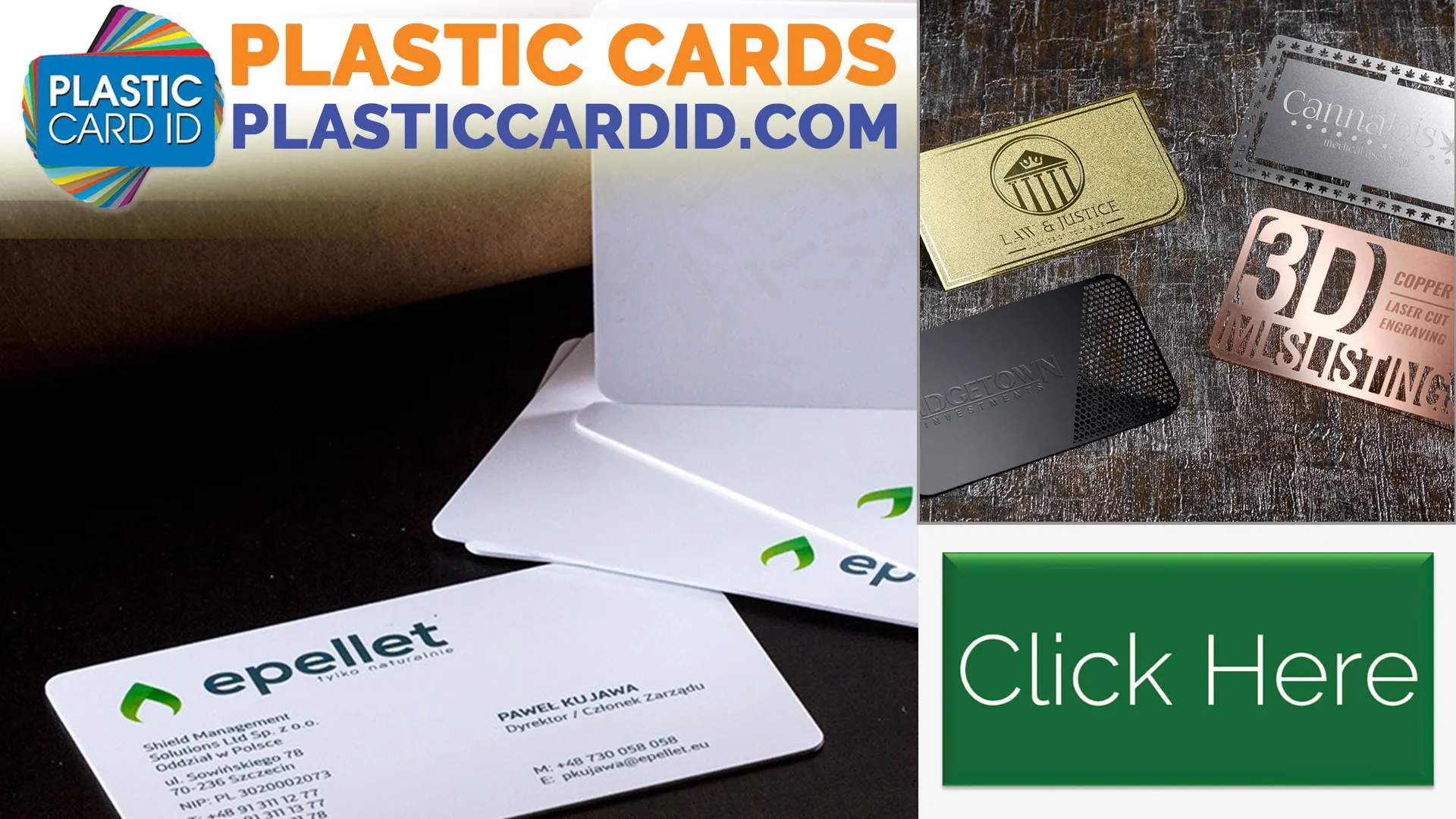
Click the image above to get started!
Unlock the Emotional Potential with Color Psychology in Plastic Card Design
Welcome! Have you ever wondered how a simple plastic card can pack such an emotional punch? Just think about the last time you received a membership card, gift card, or loyalty card. Was it the texture, the weight, or maybe the color that caught your attention? That's right, color. At Plastic Card ID , we know that a pop of color is more than just a pretty hue-it's a silent messenger that communicates values, emotions, and brand identity. Here's how we harness the subtle yet powerful language of colors in our card designs.
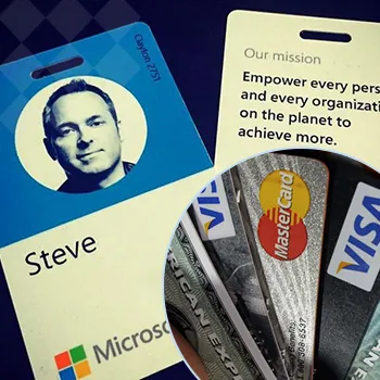
When you carry one of our cards, it's not just about having another piece of plastic in your pocket. It's about carrying a piece of a brand's heart. Each color we choose is picked meticulously to strike the right chord. From tranquil blues that echo trust and security, to vibrant oranges that exude enthusiasm and energy, every shade has a story to tell. Our nuanced approach to plastic card design ensures that there's a purpose behind every color selection.
Now, let's dive into the color-infused world of card design and see how the shades you choose can do more than meet the eye. Let us walk you through the rainbow of possibilities and how it can elevate your brand's message from mundane to memorable. And remember, if you have any questions or are itching to place a new order, you can always reach us easily at 800.835.7919 .
The Psychology Behind Colors and Brand Perception
First things first, color psychology is the study of how colors affect our behavior and decisions. For example, ever noticed how fast-food chains often use red in their branding? That's because red is known to stimulate appetite and create a sense of urgency. We apply the same principles in our card designs, using various colors to tap into different emotions.
By choosing the right palette, we help reflect your brand's voice and values. A sleek black card might convey luxury and sophistication, while a green one might emphasize health and eco-consciousness. This tasteful use of color psychology can turn your card into a powerful branding tool.
Colors That Command Attention
Some colors have the natural ability to make heads turn. Our design team knows which hues can catch the eye and create a striking first impression. Whether it's a rosy pink that's soft and inviting or a sunshine yellow that's cheerful and playful, these attention-grabbing colors could be the icebreaker your card design needs.
These spotlight-stealing shades can also be critical in promotional campaigns, where you want your card to stand out from the competition. Just imagine the instant impact of a vividly colored card in a sea of mundane ones-it's a simple yet effective way to get noticed.
Enhancing User Experience with Colors
We don't just stop at aesthetics. The colors we select can also enhance the user experience. Cool hues like blue and green can create a calming effect, possibly making the transaction process feel more relaxing. Warm colors might provide a welcoming and friendly vibe-like a familiar pat on the back every time the card is used.
It's this thoughtful implementation of color that turns a basic card into an emotional experience. Every time the card is swiped, tapped, or handed over, there's a subtle reminder of the brand's personality and commitment to their customer's experience.
Creating a Cohesive Brand Narrative with Color Selection
A color can speak a thousand words, and at Plastic Card ID , we're fluent in this vibrant language. Selecting the ideal color for your plastic card is instrumental in building a cohesive narrative for your brand, aligning with your overall marketing strategy. It's about consistency, recognition, and creating a lasting impression.
Toning in or standing out, every hue we pick is chosen with the objective to further your brand story. Our goal is to provide cards that aren't just functional but are also a testament to what your brand stands for. They're part of the conversation, a visual cue that evokes the right emotions and actions.
When you entrust your card design to us, you're not just getting a product, you're receiving a uniquely crafted item that resonates with your clients on a deeper level. Our commitment is at the forefront of every decision we make, from the initial concept to the final product that reaches your hands. And if you're ever in need, just give us a ring at 800.835.7919 we're here to serve you, from coast to coast.
Aligning Colors with Your Brand Values
Choosing colors that reflect your brand's core values is like picking the right words to describe your best friend. We work with you to understand your brand's personality and select a color palette that parallels your message. Just like a friend would know exactly what to say, your card conveys the essence of your brand without uttering a word.
Whether it's integrity, creativity, or reliability, the colors on your card will be a visual shorthand for the values that your brand holds dear. It's a critical step in strengthening your brand association and loyalty among your customers.
Curating the Right Mood for Customer Interaction
The mood you wish to set during customer interaction is tantamount to setting the stage for a play. The colors on your plastic card design play a leading role in creating the atmosphere and guiding the customer's emotions. A harmonious color scheme can put them at ease or energize them, depending on the action you want to inspire.
It's like setting the right lighting for a dinner date too bright, and it's clinical; too dim, and it's hard to see. We strike the perfect balance to ensure your card supports the desired ambiance for the ideal customer interaction.
Balancing Trends and Timelessness in Color Choice
Staying current yet timeless is the balancing act we master in every design. Trendy colors might look great today but could quickly become yesterday's news. We root our color choices in psychological principles that stand the test of time while also staying attuned to the pulse of the market.
We believe in creating cards that remain relevant and resonate with audiences, enduring beyond fleeting trends. By finding the sweet spot between modern and classic, your card retains its impact for years to come.
Making Every Swipe Count with Strategic Color Placement
The placement of color on your card isn't just about looking good-it's about functionality and guiding the user's eye to the right places. At Plastic Card ID , we consider how each swipe, tap, or display of your card reinforces your brand. Strategic color placement can elevate the simplest of designs to something users will remember and engage with time and time again.
We appreciate the importance of a card layout that's both attractive and practical. A pop of contrasting color around the logo, for example, makes your brand instantly recognizable, while a subtle background shade can make the important details stand out. It's not just a card; it's a miniature billboard for your brand in the wallets of your customers.
Recycling is simple but significant for the environment, and while we're here to discuss the power of colors and design, we do encourage you to recycle old plastic cards when they're no longer needed. Moving on, let's explore how we ensure that every element of your card's design has a purpose.
If inspiration has struck and you're ready to launch your card's design into a colorful new dimension, don't hesitate to contact us at 800.835.7919 . We're your nationwide partner in creating cards that do more than just conduct transactions; they communicate, connect, and captivate.
Guiding Attention to Actionable Areas
The right color in the right place can be the beacon that guides users to action. Think of it as visual cues on a map. With intentional color placement, we highlight the most important parts of the card, whether it's a contactless payment symbol, a QR code, or your customer service number.
Each card we design holds these visual signposts, ensuring a smooth, intuitive interaction every time it's used. It's about making your card user-friendly while also maintaining a sleek, professional appearance.
Using Contrast to Enhance Readability
Contrast is a designer's best friend, and in the world of plastic cards, it's essential for ensuring your card is as readable as it is attractive. We use contrasting colors to make text pop and ensure all information is legible at just a glance.
It's about taking the guesswork out of using the card no squinting, no struggling, just a clear, bold message that's easy to read and understand. It's another way we put the user's experience first.
Fostering Brand Recall with Consistent Color Themes
A consistent color theme can make your card instantly identifiable, much like a signature tune can remind you of your favorite show. We focus on creating a color scheme that becomes synonymous with your brand, encouraging customers to think of you every time they see similar shades.
It's the kind of brand recall that companies dream of creating a lasting impression that keeps customers coming back. Our card designs serve as a constant reminder of your brand, working silently in the background to reinforce your message every day.
Thank you for embarking on this colorful journey with us. We hope you are now bursting with ideas and ready to infuse your brand with the emotional power of colors. If you"d like to discuss your card designs or if you're eager to place an order, our dedicated team is only a call away at 800.835.7919 . Let's work together to ensure your plastic cards wield the power of color psychology to create meaningful connections with every swipe.
 Copyright © All rights reserved. Click here to view